☰ Menu

Cross-country comparisons of Covid-19


It always feels cold crunching numbers that represent very tragic events, but I think we need to learn all we can about this pandemic and statistical analysis can help. In this blog I look at a few simple factors that may have created the conditions for some countries to suffer from very high death rates due to Covid-19 while other countries have escaped the worst.

When comparing across countries, the starting point should be adjusting for the size of population. So, using WHO data from 1st May I looked at the 30 countries with the highest absolute deaths and calculated their deaths-per-million rate. On that basis, Belgium is the country with the highest death rate at just over 650 per million. Then comes Spain, Italy, UK, France and the Netherlands, with a range from 550 down to 285 per million. While all of these examples are European, there are neighbouring countries with much lower numbers. Germany, Denmark and Austria all have recorded death rates below 100 per million. The USA, with the highest absolute number of deaths comes in at just under 200, while China (if you believe the official figures) scores just 3 per million.

Apart from different government strategies, we might expect these death rates to be affected by how crowded a country is (making the infection easier to spread) and by the underlying health of the population. Does this show up in the data?

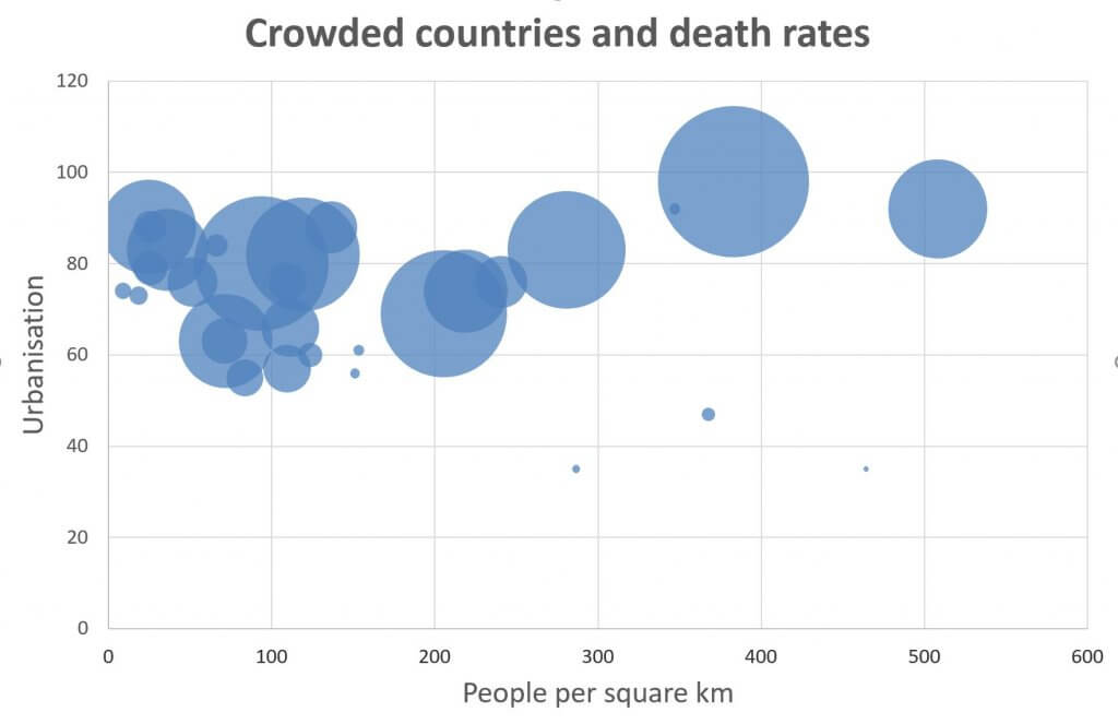
The first chart below shows people per square km on the x-axis and the share of the population living in cities (the urbanisation rate) on the y-axis. Each country is plotted as a bubble, with the size of that bubble representing their deaths-per-million. We might expect the biggest bubbles to be towards the top and the right side of the chart. It’s certainly true that all the small bubbles have either low urbanisation rates and/or a relatively low population density.

The second chart below shows the median age of the population on the x-axis. We know older people have much lower survival rates amongst infected patients. On the y-axis, obesity rates are shown: there is evidence to suggest that being overweight reduces your chances of survival. Again, each country is shown as a bubble, sized according to its death rate. It’s pretty clear in this chart that low obesity-rate countries have all escaped the worst effects of the disease.

I then narrowed the study down to include only those countries with urbanisation rates above 60 and obesity rates over 15%. Within this smaller sample, the countries with the lowest death rates all had median ages of the population below 35. So, I stripped those countries from the study too. That left 14 countries. They all had high urbanisation rates, high obesity rates and average ages over 35. The final chart below shows population density on the x-axis and death rates on the y-axis. The dotted line is the line-of-best-fit, displaying a loose positive correlation between population density and death-rates amongst this group of countries. The UK, a bright red dot on the chart, lies slightly above the line, suggesting it has suffered slightly more deaths than might have been expected given all these factors. Other factors not considered here warrant further investigation. Studies suggest the virus doesn’t survive for long in heat or direct sunlight, so hotter, sunnier countries should do better. Studies based on ethnicity suggest BAME people have lower survival rates than others, so countries with higher proportions of those people might have worse death rates. What role government policy has had on relative performance (good or bad) is for others to consider.

I wish you all the very best during this difficult time.